Technical vs Fundamental Analysis
⏱ 5 min readBefore you start placing indicators on charts, it helps to understand why traders use charts in the first place — and what the alternative approach looks like. There are two main schools of thought in financial analysis: technical analysis and fundamental analysis.
Fundamental Analysis
Fundamental analysis involves studying the underlying economic factors that drive an asset's value. For stocks, this means earnings reports, revenue growth, debt levels, and management quality. For currencies (Forex), it means central bank interest rate decisions, inflation data, GDP growth, and employment figures.
Fundamentals tell you what an asset is worth. They tend to be more relevant over longer timeframes — months and years rather than hours and days.
Technical Analysis
Technical analysis focuses entirely on price action and chart patterns. It does not care about earnings reports or news events — it only looks at what price has done historically and what patterns suggest it might do next.
The idea is that all available information is already reflected in the price. If a company just released great earnings, the price would have already moved up before most retail traders even saw the news. The chart shows the result of all that activity — the sum total of every participant's buying and selling decisions.
| Technical Analysis | Fundamental Analysis |
|---|---|
| Studies price charts and patterns | Studies economic data, news, and earnings |
| Works on any timeframe | Best for long-term investing |
| Gives you timing signals | Tells you what an asset is worth |
| Visual — easy to learn and apply | Requires deep knowledge of economics |
| Used by most active retail traders | Used by institutional investors and analysts |
Why Most Retail Traders Use Technical Analysis
The majority of active retail traders — whether they trade Forex, stocks, crypto, or indices — rely primarily on technical analysis. The reasons are practical: charts are visual, accessible, and can be applied to any market on any timeframe. You don't need a finance degree to spot a moving average crossover or an RSI reading below 30.
That said, the two approaches are not mutually exclusive. Many professional traders use fundamentals for direction and technicals for timing — knowing the general economic trend but using chart signals to find precise entry and exit points.
Technical analysis = studying price charts and patterns. Fundamental analysis = studying economic data, news, and earnings. Both have merit. For short-to-medium-term trading, technical analysis gives you the timing. This course focuses entirely on the technical side.
- Technical analysis = price charts and patterns
- Fundamental analysis = economic data, earnings, news
- Technicals are preferred for short-to-medium-term trading
- Many pros combine both: fundamentals for direction, technicals for entry timing
Quick Quiz
1. What does technical analysis primarily study?
2. Which analysis approach is best suited for short-to-medium-term active trading?
3. Many professional traders combine both approaches. How do they typically use them?
The Three Core Principles
⏱ 6 min readTechnical analysis is not just a collection of tools — it is built on a set of foundational beliefs about how markets work. Understanding these principles helps you understand why the tools work, rather than just how to use them mechanically.
The three core principles were first articulated by Charles Dow in the early 1900s and remain the backbone of all technical analysis today.
Principle 1: Price Discounts Everything
This is the most important principle. It states that all available information — past, present, and even anticipated future events — is already reflected in the current price. Interest rate decisions, earnings reports, geopolitical events, and trader psychology are all baked into what the chart is showing you right now.
This is why technical analysts say there is no need to analyse fundamentals separately — the chart already tells you everything. If a currency pair was going to be affected by an interest rate rise, big banks would have already positioned for it. That positioning shows up on the chart.
Principle 2: Price Moves in Trends
Markets do not move randomly. Price tends to move in one direction over a sustained period — a trend — and will continue in that direction until something causes it to reverse. This is why the classic trader's mantra is "the trend is your friend."
Identifying the current trend is the foundation of most technical strategies. Are we in an uptrend (higher highs and higher lows)? A downtrend (lower highs and lower lows)? Or are we ranging sideways? Once you know the trend, you align your trades with it rather than fighting against it.
- Uptrend
- Price makes higher highs and higher lows over time. Buyers are in control. Look for buying opportunities.
- Downtrend
- Price makes lower highs and lower lows over time. Sellers are in control. Look for selling opportunities.
- Ranging / Sideways
- Price oscillates between a defined high and low with no clear directional bias. Different strategies apply.
Principle 3: History Tends to Repeat Itself
Markets are driven by human psychology — specifically fear and greed. Because human psychology is relatively consistent across time, traders tend to react the same way to similar situations. This means that chart patterns and indicator signals that worked in the past have a reasonable probability of working again in the future.
When traders see a well-known bullish pattern forming, many of them act on it — which itself causes the pattern to play out. This is partly a self-fulfilling prophecy, and it's one of the reasons technical patterns have real predictive power when enough market participants are watching the same thing.
Technical analysis is especially powerful in liquid markets (Forex major pairs, major indices, large-cap stocks) where millions of traders are watching the same charts. The more participants that believe in a pattern, the more likely it is to play out — because they all act on it simultaneously.
The three pillars: 1) Price discounts everything — the chart already knows. 2) Price moves in trends — align with the trend. 3) History repeats — patterns and signals have proven probability. These aren't just theories; they are the reason technical analysis works in practice.
Quick Quiz
1. What does "price discounts everything" mean?
2. Which of the following best describes an uptrend?
3. Why do historical chart patterns tend to repeat?
4. The classic trader's mantra related to Principle 2 is:
Types of Technical Indicators
⏱ 7 min readThere are hundreds of technical indicators — but they all fall into a small number of categories. Understanding what type of indicator you are using is more important than knowing the formula behind it. Each type serves a different purpose, and using them correctly means knowing which category they belong to.
Leading Indicators — They Predict
Leading indicators attempt to predict future price moves before they happen. They give signals ahead of the actual price movement, which makes them useful for timing entries early. The downside is they generate more false signals — price might not follow through as predicted.
The most common leading indicators are RSI (Relative Strength Index) and Stochastic Oscillator. Both measure whether a market is overbought or oversold, giving you a heads-up that a reversal might be coming.
Lagging Indicators — They Confirm
Lagging indicators confirm a move after it has already begun. They are slower to react but generate more reliable signals because they require the price to actually start moving before they fire. The trade-off is that you enter later — you might miss some of the initial move, but you have higher confidence.
Moving averages and MACD are classic lagging indicators. They smooth out price data and help you confirm that a trend is genuinely underway rather than a brief spike.
Volume Indicators
Volume indicators measure the buying and selling pressure behind price moves. A price move with high volume is considered more significant than one with low volume — volume is the fuel behind the fire. Common volume indicators include On-Balance Volume (OBV) and Volume Profile.
RSI
Measures speed and magnitude of price changes. Above 70 = overbought. Below 30 = oversold.
Stochastic
Compares closing price to the price range over a given period. Predicts reversal points.
Moving Averages
Smooth out price data to show trend direction. SMA, EMA — both are lagging.
MACD
Shows momentum by comparing two moving averages. Crossovers signal trend changes.
OBV
On-Balance Volume — adds volume on up days, subtracts on down days. Shows buying pressure.
Volume Profile
Shows where the most trading activity happened at each price level — identifies key zones.
The Critical Point: Know What You Are Using
One of the most common beginner mistakes is stacking multiple lagging indicators on top of each other, thinking more confirmation is better. If you have three different moving averages and MACD all telling you the same thing, you have not gained more confidence — you just have four versions of the same lagging signal.
A well-built indicator setup uses one indicator from different categories — for example, a lagging indicator for trend direction and a leading indicator for entry timing. They complement each other rather than just repeating the same information.
Using multiple indicators from the same category gives you false confidence. Four lagging indicators all saying "uptrend" does not make the signal four times stronger — it is still one signal, just repeated four times. Diversify across indicator types.
Leading indicators (RSI, Stochastic) try to predict future moves. Lagging indicators (Moving Averages, MACD) confirm moves already in progress. Volume indicators measure pressure behind the move. The best setups combine indicators from different categories — one to identify trend, one to time entry.
Quick Quiz
1. RSI and Stochastic are classified as what type of indicator?
2. Moving averages and MACD are examples of which indicator type?
3. Why is it a mistake to use multiple indicators from the same category?
Simple Moving Average (SMA)
⏱ 6 min readThe Simple Moving Average is one of the oldest and most widely used technical indicators. Despite its simplicity, it remains one of the most powerful tools for identifying trend direction and filtering out market noise.
What is an SMA?
The SMA is literally just the average closing price over a set number of candles. An SMA(20) calculates the average of the last 20 candlestick closing prices. As each new candle closes, the oldest price drops off the calculation and the newest one is added. This creates a smooth, rolling line on your chart.
SMA(20) = (Close₁ + Close₂ + Close₃ + ... + Close₂₀) ÷ 20
Moving averages plotted on a price chart — the smooth lines show trend direction without the noise of individual candles
Common SMA Settings
Different SMA periods serve different purposes. Shorter periods react faster to price but produce more noise. Longer periods are smoother but react more slowly.
| SMA Period | Timeframe Use | What It Shows |
|---|---|---|
| SMA(20) | Short-term | Short-term trend; often acts as near-term support/resistance |
| SMA(50) | Medium-term | Medium-term trend; watched closely by institutional traders |
| SMA(100) | Medium-long | Longer-term trend direction; fewer signals but more reliable |
| SMA(200) | Long-term | The major trend dividing line — above it is bullish, below is bearish |
How Traders Use the SMA
The primary use of the SMA is to identify trend direction. If price is above the SMA and the SMA is pointing upward, you are in an uptrend. If price is below the SMA and it is pointing downward, you are in a downtrend.
The SMA also acts as a dynamic support or resistance level. In an uptrend, price often bounces off the SMA when it pulls back — buyers step in at the average because it represents a "fair value" zone.
The 200-period SMA (or EMA) on the daily chart is watched by virtually every institutional trader in the world. Price trading above the 200 SMA is broadly considered bullish. Price trading below it is broadly considered bearish. When price approaches this level, expect a reaction — it is a self-fulfilling line because so many traders are watching it.
The SMA is the average closing price over a set period. SMA(20) = average of last 20 closes. It smooths out noise to show trend direction. Price above a rising SMA = uptrend. Price below a falling SMA = downtrend. The SMA also acts as dynamic support and resistance.
Quick Quiz
1. How is an SMA(20) calculated?
2. If price is above a rising SMA, this generally indicates:
3. Why is the SMA(200) particularly significant?
Exponential Moving Average (EMA)
⏱ 6 min readThe Exponential Moving Average is the more popular sibling of the SMA — especially among active traders who work on shorter timeframes. The key difference is in how it weights price data.
SMA vs EMA — The Core Difference
The SMA treats every price in the calculation equally. The price from 20 candles ago carries the same weight as the price from one candle ago. The EMA is different: it gives more weight to recent prices and progressively less weight to older prices.
The result? The EMA reacts faster to price changes than the SMA. When price starts moving, the EMA will turn sooner. This makes it better suited for active traders who want to get into trends earlier.
Common EMA Settings
Active traders use a small set of well-known EMA periods. These are watched by so many traders that they become self-reinforcing — price frequently reacts at these levels simply because everyone expects it to.
- 9 EMA
- Very fast-reacting. Used by scalpers and short-term traders on lower timeframes (5m, 15m). Shows immediate momentum.
- 21 EMA
- Short-term trend indicator. Popular on 1-hour and 4-hour charts. Often the first bounce zone in an uptrend.
- 50 EMA
- Medium-term trend. Key dynamic support/resistance. Widely watched on daily charts.
- 200 EMA
- The major long-term trend line. Price above = overall bullish. Price below = overall bearish. Powerful support/resistance.
When to Use EMA vs SMA
Most active traders prefer the EMA for shorter timeframes (1-hour, 4-hour) because it reacts faster and gives earlier signals. The SMA is sometimes preferred on higher timeframes (daily, weekly) where you want a smoother, less reactive line.
In practice, many traders simply use EMAs across the board. The important thing is to be consistent with your settings — pick your periods and stick with them, so you can learn how price typically behaves around those levels.
- EMA gives more weight to recent prices than the SMA
- EMA reacts faster — better for active trading on lower timeframes
- Common EMAs: 9, 21, 50, 200
- The 200 EMA on the daily chart is one of the most significant lines in all of trading
- Use EMA for faster signals; SMA for smoother, longer-term trend reading
The EMA gives more weight to recent prices, making it faster-reacting than the SMA. Most traders prefer EMAs for active trading. Key settings: 9 EMA (very fast), 21 EMA (short-term), 50 EMA (medium-term), 200 EMA (major trend line). Pick your periods and learn how price behaves around them.
Quick Quiz
1. What is the key difference between an EMA and an SMA?
2. Which EMA period is best described as the "major long-term trend line"?
3. Why do many traders prefer the EMA over the SMA for active trading?
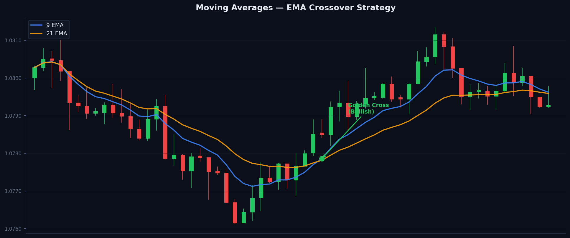
The Golden Cross and Death Cross
⏱ 5 min readThe Golden Cross and Death Cross are two of the most famous signals in all of technical analysis. They appear on major financial news channels, get discussed by professional fund managers, and are watched by millions of traders worldwide. Understanding them is essential.
The Golden Cross — Bullish Signal
A Golden Cross occurs when a shorter-term moving average crosses above a longer-term moving average. The classic version is when the 50 EMA crosses above the 200 EMA on the daily chart.
This signal suggests that short-term momentum has shifted to the upside and that the market may be entering a sustained bullish phase. It is considered a major trend change signal — not a scalp signal, but a longer-term directional shift.
- Golden Cross
- 50 EMA crosses ABOVE the 200 EMA. Bullish signal. Indicates a potential shift from downtrend to uptrend.
- Death Cross
- 50 EMA crosses BELOW the 200 EMA. Bearish signal. Indicates a potential shift from uptrend to downtrend.
The Death Cross — Bearish Signal
The Death Cross is the opposite: the 50 EMA crosses below the 200 EMA. This signals that short-term momentum has shifted to the downside, and a sustained bearish phase may follow. When this signal appears on major indices like the S&P 500, it generates significant media coverage.
Important Caveats
The Golden and Death Cross are lagging signals — they confirm a trend change after it has already begun. By the time the crossover occurs, the market may have already moved significantly in the new direction. This is the trade-off: high reliability but late entry.
These signals work best on daily and weekly charts. On lower timeframes (1-hour, 15-minute), crosses happen far more frequently and generate more false signals because they are too sensitive to short-term noise.
A Golden Cross or Death Cross on a 5-minute chart is nearly meaningless — they happen dozens of times per day. These signals are most powerful on the daily timeframe and above, where they represent a genuine major trend shift after sustained price movement.
Golden Cross = 50 EMA crosses above 200 EMA = bullish trend change signal. Death Cross = 50 EMA crosses below 200 EMA = bearish trend change signal. These are major signals, best used on daily charts. They are lagging — confirmation comes after the trend has begun — but they are highly reliable when they appear.
Quick Quiz
1. What defines a Golden Cross?
2. On which timeframe are Golden Cross and Death Cross signals most reliable?
3. Are Golden and Death Cross signals leading or lagging?
Using MAs as Dynamic Support and Resistance
⏱ 6 min readOne of the most practical applications of moving averages is using them as dynamic support and resistance levels. Unlike static horizontal levels, moving averages move with the price — they are constantly adjusting, which is why they are called "dynamic."
How Dynamic Support Works
In a healthy uptrend, price does not move straight up indefinitely. It rises, pauses, and pulls back — then buyers step in again and push it higher. Where do those buyers tend to step in? Very often, at or near a key moving average.
This happens because many traders have buy orders waiting at the 21 EMA or 50 EMA, expecting those levels to hold as support. When price pulls back to those levels, orders execute and price bounces. The moving average acted as dynamic support.
The Same Principle in Downtrends — Dynamic Resistance
In a downtrend, the same logic applies in reverse. Price falls, bounces upward slightly, but then gets rejected at or near a key moving average — sellers are waiting there. The moving average acts as dynamic resistance, a ceiling that slopes downward with the trend.
Which Moving Averages to Watch
Not all moving averages are equally useful as dynamic S/R levels. The ones that matter most are those that thousands of other traders are watching:
- 21 EMA — Popular on 1-hour and 4-hour charts for shorter-term trend traders
- 50 EMA — One of the most watched levels on daily charts; strong bounce zone in trends
- 200 EMA — The major long-term dynamic support/resistance; big reactions when price approaches this level
In an uptrend, look for buying opportunities when price pulls back to the 21 EMA or 50 EMA — especially if the pullback also aligns with a static support level or an RSI reading approaching oversold territory. The convergence of multiple signals at one price level is called confluence, and it dramatically improves trade quality.
Moving averages act as dynamic (moving) support and resistance levels. In uptrends, price often bounces off the 21 EMA or 50 EMA — this is where buyers step in. In downtrends, price often gets rejected at these levels — this is where sellers step in. The 50 EMA and 200 EMA are particularly powerful due to the sheer number of traders watching them.
Quick Quiz
1. What makes moving average support/resistance "dynamic" rather than "static"?
2. In a downtrend, what role does the 50 EMA typically play when price bounces up to it?
3. Which moving averages are the most useful as dynamic S/R levels and why?
What is RSI?
⏱ 7 min readThe Relative Strength Index (RSI) is one of the most widely used technical indicators in the world. Developed by J. Welles Wilder Jr. in 1978, it remains a cornerstone tool for traders across every market — Forex, stocks, crypto, and indices alike.
What RSI Measures
RSI measures the speed and magnitude of recent price changes. Specifically, it compares the average size of recent up-moves to the average size of recent down-moves. The result is a single number that oscillates between 0 and 100.
- RSI Above 70
- The asset is considered overbought. Recent gains have been unusually strong. A pullback or reversal may be approaching.
- RSI Below 30
- The asset is considered oversold. Recent losses have been unusually large. A bounce or reversal may be approaching.
- RSI at 50
- The neutral zone. Neither buyers nor sellers have a clear advantage. Often acts as support in uptrends and resistance in downtrends.
Default Setting: Period 14
The standard RSI uses a 14-period lookback — it analyses the last 14 candles to calculate its reading. This default works well across most timeframes and is what the vast majority of traders use. Shorter periods (e.g. RSI(7)) make it more sensitive and faster-reacting; longer periods (e.g. RSI(21)) make it smoother and slower.
RSI = 100 − [ 100 ÷ (1 + (Average Gain ÷ Average Loss)) ]
You don't need to calculate this by hand — your charting platform does it automatically. What matters is understanding what the number means.
How to Use Overbought and Oversold Readings
When RSI reaches above 70, it signals that the recent rally has been unusually fast. This does not automatically mean "sell" — it means the move has been strong and momentum may be getting exhausted. Similarly, below 30 does not automatically mean "buy" — it signals exhausted selling.
The overbought/oversold readings work best as entry timing signals when combined with price action. An RSI at 28 near a major support level is a much stronger buy signal than an RSI at 28 in open air with no nearby support.
Do not blindly sell every time RSI hits 70 or buy every time it hits 30. In a strong trending market, RSI can stay above 70 for extended periods as momentum continues. A market that is "overbought" can stay overbought for a very long time. Context is everything.
RSI measures the speed and magnitude of price changes. It ranges from 0 to 100. Above 70 = overbought (potential reversal warning). Below 30 = oversold (potential bounce warning). Default period: 14. RSI is a leading indicator — use it alongside price action and other tools for best results.
Quick Quiz
1. What range does RSI oscillate between?
2. What does an RSI reading above 70 indicate?
3. What is the default period setting for RSI?
4. Why is it a mistake to blindly sell every time RSI reaches 70?
RSI Divergence
⏱ 8 min readRSI divergence is one of the most powerful reversal signals in technical analysis. It tells you that something is changing beneath the surface — that momentum is weakening even as price continues in its current direction. This is often an early warning of a trend change.
What is Divergence?
Divergence occurs when price and RSI move in opposite directions. Normally, RSI rises when price rises and falls when price falls — they move together. Divergence is when they disagree — and that disagreement is meaningful.
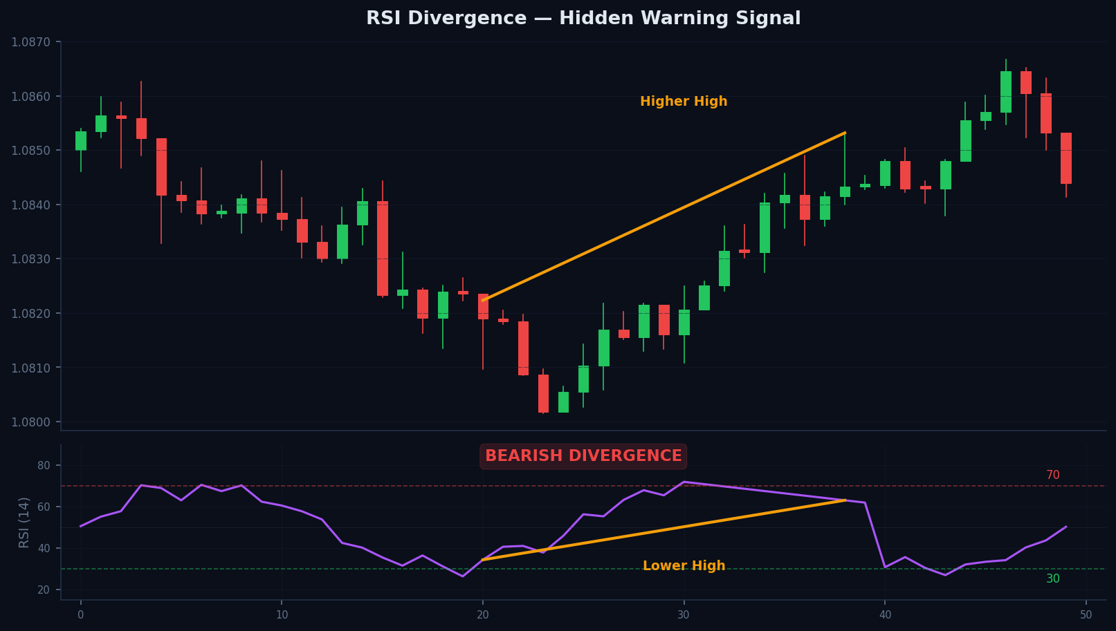
RSI divergence — price makes a higher high but RSI makes a lower high, warning that bullish momentum is fading
Bearish Divergence — Reversal Warning in an Uptrend
Bearish divergence forms when price makes a higher high but RSI makes a lower high at the same time. Price is still going up, but RSI is telling you that the buying momentum behind that move is weakening. Sellers are quietly gaining ground. This is a warning that the uptrend may be running out of steam.
- Price
- Makes a HIGHER HIGH — on the surface, the uptrend looks strong and healthy.
- RSI
- Makes a LOWER HIGH — momentum behind the move is actually weaker than the previous push.
- Signal
- Bearish divergence — reversal warning. The trend may be about to reverse or pull back significantly.
Bullish Divergence — Reversal Warning in a Downtrend
Bullish divergence is the opposite: price makes a lower low but RSI makes a higher low. Price is still falling, but selling momentum is weakening. Buyers are beginning to absorb selling pressure. This warns that the downtrend may be losing strength and a bounce or reversal could be near.
- Price
- Makes a LOWER LOW — on the surface, the downtrend looks to be continuing.
- RSI
- Makes a HIGHER LOW — sellers are losing momentum even as price sets a new low.
- Signal
- Bullish divergence — reversal warning. The downtrend may be about to reverse or bounce strongly.
How to Trade Divergence
Divergence alone is not a trade signal — it is a warning that you should be watching for confirmation. The actual entry signal comes when price action confirms the reversal: a key support/resistance break, a reversal candlestick pattern, or a change of structure in price.
Divergence is most reliable when it forms near a key support or resistance level. A bullish divergence at a major daily support is a much higher-quality signal than one that appears in the middle of the chart with no nearby structural context.
- Bearish divergence: price = higher high, RSI = lower high → reversal warning
- Bullish divergence: price = lower low, RSI = higher low → reversal warning
- Divergence is a warning, not a standalone entry signal — wait for price confirmation
- Most powerful when it forms at key support/resistance levels
- Use on multiple timeframes — higher timeframe divergence is stronger
RSI divergence is price and RSI moving in opposite directions. Bearish divergence (price HH, RSI LH) warns of weakening upside momentum. Bullish divergence (price LL, RSI HL) warns of weakening downside momentum. Always wait for price confirmation before entering — divergence is a heads-up, not a trigger.
Quick Quiz
1. What is RSI bearish divergence?
2. Bullish RSI divergence is best described as:
3. Divergence alone should be treated as:
RSI as a Trend Filter
⏱ 5 min readMost traders learn about the overbought (70) and oversold (30) levels first and stop there. But there is a more advanced — and arguably more useful — way to use RSI: as a trend filter.
The 40–60 Zone Rule
In strong trending markets, RSI does not simply oscillate between 30 and 70 in equal measure. It tends to stay in a specific zone depending on the direction of the trend:
- Strong Uptrend
- RSI typically stays between 40 and 80. It rarely falls below 40. Pullbacks to the 40–50 zone are potential buying opportunities.
- Strong Downtrend
- RSI typically stays between 20 and 60. It rarely rises above 60. Bounces to the 50–60 zone are potential selling opportunities.
- Ranging Market
- RSI oscillates freely between 30 and 70 with no consistent zone bias. Classic overbought/oversold signals are more reliable here.
Using RSI Zones Practically
The key insight is this: if RSI is holding above 50 during pullbacks in a supposed uptrend, the trend is strong and intact. If RSI starts consistently breaking below 50 or even approaching 40, it suggests the trend is losing strength and you should be more cautious about new long entries.
The Practical Application
When analysing a market, first determine the trend using your EMAs. Then check where RSI is behaving during pullbacks:
- If RSI bounces above 40–50 during pullbacks → trend is strong, continue looking for longs
- If RSI cannot get above 60 during bounces in a downtrend → trend is strong, continue looking for shorts
- If RSI behaviour is mixed, crossing 50 in both directions → likely a ranging market, use range strategies
This approach stops you from making a classic mistake: blindly shorting a market just because RSI hit 70 in a strong uptrend. In a powerfully trending market, RSI at 70 is normal — the trend has not ended just because a momentum indicator looks "high."
In strong uptrends, RSI stays above 40–50 and rarely dips below. In strong downtrends, RSI stays below 50–60. Use these zone behaviours as a trend filter — if RSI is consistently holding in the "trend zone," the move is strong. If RSI can't maintain the zone, the trend is weakening. Never blindly fade an indicator reading without context.
Quick Quiz
1. In a strong uptrend, RSI typically stays in which zone?
2. What does it suggest if RSI repeatedly fails to rise above 60 during bounces in a downtrend?
3. A trader sees RSI at 72 in what appears to be a strong uptrend. What is the correct interpretation?
What is MACD?
⏱ 7 min readMACD — Moving Average Convergence Divergence — is a trend-following momentum indicator. It was developed by Gerald Appel in the late 1970s and remains one of the most widely used technical indicators in the world. Its popularity comes from its versatility: it shows you trend direction, momentum, and crossover signals all in one indicator.
The Three Components of MACD
MACD consists of three distinct elements, each displayed below your price chart:
- MACD Line
- The difference between the 12-period EMA and the 26-period EMA. When price is rising fast, the short-term EMA pulls away from the long-term EMA, making the MACD line rise.
- Signal Line
- A 9-period EMA of the MACD line. It smooths out the MACD and is used to generate crossover buy and sell signals.
- Histogram
- The visual bar chart showing the difference between the MACD line and the Signal line. Growing bars = increasing momentum. Shrinking bars = momentum fading.
MACD Line = EMA(12) − EMA(26) | Signal Line = EMA(9) of MACD Line | Histogram = MACD Line − Signal Line
Understanding the MACD Visually
When the MACD line is above zero, the 12-period EMA is above the 26-period EMA — this indicates an upward trend in momentum. When MACD is below zero, the 12 EMA is below the 26 EMA — downward momentum. The zero line is like the neutral point.
The most widely watched signal is the MACD line crossing the Signal line:
- MACD crosses above Signal line → bullish crossover → potential buy signal
- MACD crosses below Signal line → bearish crossover → potential sell signal
MACD shows the relationship between two EMAs (12 and 26). It has three parts: the MACD line, Signal line, and Histogram. MACD crossing above Signal = bullish. MACD crossing below Signal = bearish. MACD above zero = upward momentum. Below zero = downward momentum.
Quick Quiz
1. How is the MACD line calculated?
2. What does it mean when the MACD line crosses above the Signal line?
3. What does the MACD Histogram represent?
MACD Crossover Trades
⏱ 6 min readThe MACD crossover is the most widely used MACD signal. It is simple, visual, and has been generating trade signals for decades. Understanding both its strengths and its limitations will help you use it effectively rather than mechanically.
The Bullish Crossover
A bullish crossover occurs when the MACD line crosses from below to above the Signal line. This suggests that short-term momentum (12 EMA) is accelerating relative to the medium-term trend (26 EMA), and the signal line (9-period average of MACD) is being exceeded. Traders interpret this as a potential buy signal.
The signal is strongest when the crossover occurs below the zero line — this means the crossover is happening after a period of bearish momentum, and the shift to bullish momentum is more significant.
The Bearish Crossover
A bearish crossover occurs when the MACD line crosses from above to below the Signal line. Short-term momentum is weakening relative to the trend. Traders interpret this as a potential sell signal.
The signal is strongest when the crossover occurs above the zero line — crossing down from a bullish region indicates a more meaningful shift from bullish to bearish momentum.
- Strongest Bullish Signal
- MACD crosses above Signal line while both are below the zero line. Maximum shift from bearish to bullish momentum.
- Strongest Bearish Signal
- MACD crosses below Signal line while both are above the zero line. Maximum shift from bullish to bearish momentum.
The Key Limitation: False Signals in Ranging Markets
MACD crossovers work well in trending markets — where price is making sustained directional moves. In ranging or choppy markets, however, the MACD line and Signal line cross back and forth repeatedly, generating a stream of false signals that can be very costly.
This is why experienced traders always confirm the market structure before acting on a MACD crossover. If the market has been ranging sideways for weeks, a MACD crossover is likely noise. If the market has been trending clearly and a crossover forms after a healthy pullback, the signal carries much more weight.
MACD crossovers in ranging or choppy markets produce more false signals than in trending markets. Always check whether the broader market is trending before acting on a MACD crossover. Combine it with EMA direction and price structure for higher quality signals.
Bullish crossover = MACD crosses above Signal line (buy signal). Bearish crossover = MACD crosses below Signal line (sell signal). Strongest signals occur when the crossover happens below or above the zero line respectively. MACD crossovers work best in trending markets — they generate false signals in choppy/ranging conditions.
Quick Quiz
1. When is a bullish MACD crossover considered strongest?
2. Why do MACD crossovers generate poor signals in ranging markets?
3. A bearish MACD crossover is most significant when it occurs:
MACD Histogram
⏱ 5 min readThe MACD Histogram is the bar chart component of the MACD indicator. While many traders focus on the MACD and Signal line crossovers, the histogram provides an earlier and more nuanced view of how momentum is building or fading.
What the Histogram Shows
The histogram measures the distance between the MACD line and the Signal line at any given moment. It plots these as vertical bars above and below the zero line:
- Bars above zero = MACD line is above Signal line (bullish momentum)
- Bars below zero = MACD line is below Signal line (bearish momentum)
- Growing bars = momentum is increasing in that direction
- Shrinking bars = momentum is fading
Reading Momentum Shifts Early
The power of the histogram is that it gives you an early warning of a crossover before it actually happens. When histogram bars start shrinking while still in positive territory, the MACD and Signal lines are getting closer together — a bearish crossover may be approaching. You can see this before the crossover occurs.
- Growing Positive Bars
- MACD line is moving further above Signal. Bullish momentum is accelerating. The uptrend is gaining strength.
- Shrinking Positive Bars
- MACD line is getting closer to Signal. Bullish momentum is fading. Watch for a potential crossover.
- Histogram Crosses Zero
- The MACD and Signal lines have crossed. This is the classic crossover signal — the histogram going from negative to positive is a bullish momentum shift.
The histogram changing from negative to positive is one of the cleanest bullish momentum shift signals you can get from MACD. When the histogram flips positive and is combined with price trading above a key EMA, it is a very strong setup for a long entry.
The MACD histogram shows the gap between MACD and Signal lines. Growing bars = momentum increasing. Shrinking bars = momentum fading. Histogram crossing from negative to positive = bullish momentum shift. It gives early warning of crossovers before they happen — watch the bars, not just the lines.
Quick Quiz
1. What does the MACD histogram measure?
2. Shrinking positive histogram bars suggest:
3. A MACD histogram that crosses from negative to positive represents:
Building Your Indicator Setup
⏱ 6 min readOne of the most common mistakes new traders make is loading their chart with every indicator they have ever heard of — 5 moving averages, RSI, MACD, Bollinger Bands, Stochastic, VWAP, and more all stacked on top of each other. The result? Analysis paralysis. The chart looks impressive but tells you nothing useful.
The Principle: Less is More
The most effective indicator setups are minimal, purposeful, and well-understood. Each indicator on your chart should answer a specific question. Add an indicator only when you can clearly articulate what question it is answering and how you will use its output.
A well-structured two-indicator setup beats a cluttered eight-indicator setup every time — because with two, you actually understand what each is telling you and can act decisively. With eight, you spend more time reconciling conflicting signals than trading.
A Simple But Effective Framework
The most popular and battle-tested minimal indicator framework uses two complementary tools:
- Tool 1: EMA for Trend Direction
- Use the 21 EMA and 200 EMA. The 200 EMA tells you the major trend. The 21 EMA tells you the short-term momentum. Are they aligned? Then you have a clear directional bias.
- Tool 2: RSI for Timing
- RSI(14) tells you whether momentum is extreme. In an uptrend, wait for RSI to pull back toward 40–50 near an EMA level before entering. This gives you a better price and higher probability.
How This Works in Practice
With this setup, your decision process becomes structured:
- Check the EMAs: Is price above both the 21 and 200 EMA? Both EMAs pointing up? The trend is bullish.
- Wait for a pullback: Let price retrace to the 21 EMA or 50 EMA rather than chasing a breakout.
- Check RSI at the pullback: Has RSI pulled back toward 40–50? That confirms the pullback is losing momentum — buyers may step in here.
- Enter when EMA support and RSI levels align: This is your confluence setup.
Never add a new indicator until you fully understand the ones you already have. Spend 2–3 weeks trading with just EMAs and RSI. Learn how price behaves around your EMAs. Learn what RSI levels look like in different market conditions. Master two tools before you even consider adding a third.
Do not use 10 indicators at once. Pick 1–2 that serve different purposes and complement each other. The EMA + RSI combination is one of the most effective and widely used frameworks: EMAs for trend direction, RSI for entry timing. Keep it simple, understand it deeply, and master it before adding complexity.
Quick Quiz
1. What is the main problem with using too many indicators at once?
2. In the EMA + RSI framework, what role does the RSI play?
3. Before adding a new indicator to your setup, you should:
Indicator Confluence
⏱ 7 min readConfluence is one of the most important concepts in all of technical analysis. It refers to the alignment of multiple independent signals at the same price level or moment in time. When different tools — from different indicator categories — all point to the same conclusion, the probability of that trade working out increases significantly.
Why Confluence Works
Each individual indicator has a certain probability of being correct. RSI below 30 might suggest an oversold bounce is coming — but it is not a guarantee. The 200 EMA acting as support is a historically significant level — but not a guaranteed bounce. When these two coincide, however, the combined probability is much higher than either signal alone.
A Classic Confluence Example
Here is what a high-quality confluence trade setup might look like:
- Price has pulled back to the 200 EMA on the daily chart (major dynamic support — lagging indicator)
- RSI is at 31 — approaching oversold territory (leading indicator, opposite category)
- MACD histogram is shrinking as the pullback fades — bullish momentum shift forming (different lagging indicator)
- The 200 EMA also aligns with a previous horizontal support level (price action — no indicator needed)
Four different, independent signals all agreeing that this is a significant support zone. That is high-quality confluence. Each signal individually would be moderate; together they create a compelling case for a long entry.
Confluence vs Redundancy
It is critical to distinguish between confluence and redundancy. Confluence is multiple different signals agreeing. Redundancy is multiple similar signals agreeing — which adds no value.
| Real Confluence ✓ | False Redundancy ✗ |
|---|---|
| 200 EMA support + RSI at 30 + MACD bullish cross | SMA(50) + EMA(50) + SMA(100) all "supporting" price |
| Horizontal S/R zone + trend-following EMA bounce + RSI divergence | RSI oversold + Stochastic oversold + CCI oversold |
| EMA for trend + leading indicator for timing + price action pattern | Five different moving averages all on the same chart |
- Confluence = multiple independent signals agreeing at the same level
- True confluence requires signals from different categories (lagging + leading + price action)
- Multiple indicators from the same category = redundancy, not confluence
- Classic high-quality setup: 200 EMA + RSI at 30 + MACD bullish cross = strong buy zone
- The more genuinely independent signals agree, the higher the probability of the trade working
Confluence is when multiple independent signals align at the same point. The classic example: price at 200 EMA support + RSI at 30 + MACD bullish cross = very strong buy setup. True confluence requires signals from different categories. Multiple signals from the same category is just redundancy — it does not improve your probability.
Quick Quiz
1. What is indicator confluence?
2. Which of the following is true confluence (not redundancy)?
3. Why does true confluence increase trade probability?
Common Indicator Mistakes
⏱ 6 min readUnderstanding what indicators can and cannot do is just as important as knowing how to use them. Many traders spend months chasing the "perfect" indicator or making systematic errors that destroy their edge. This lesson covers the most common pitfalls — so you can avoid them from the start.
Mistake 1: Overloading the Chart
We have covered this, but it bears repeating because it is the most common error. A chart with 8 indicators looks impressive but tells you nothing clearly. When you have too many signals, they inevitably conflict, and you end up either waiting forever for "perfect" conditions or second-guessing every trade. Simplicity is a genuine edge.
Mistake 2: Using Only Lagging Indicators
If every indicator on your chart is lagging (e.g. multiple moving averages and MACD), you are always getting confirmation after the fact. By the time all your lagging indicators agree, the trade has often already moved significantly in your favour. You enter late, with a worse risk:reward ratio and less room to run. Add at least one leading indicator for timing.
Mistake 3: Ignoring Price Action
Indicators are derived from price — they are mathematical transformations of the raw price data. Price action is the source. When your indicator says one thing and price action says another, price action takes priority. A candlestick forming a clear reversal at a major structural level outweighs what an indicator is showing.
Indicators are derived from price — they cannot "know" more than price itself. If RSI says buy but price action is forming a clear bearish pattern at a major resistance level, trust the price action. Indicators are tools to help interpret price, not replacements for reading it.
Mistake 4: Not Backtesting
Before trading any indicator strategy live, you should have backtested it across different market conditions. Does it work in trending markets but fail in ranges? Does it give more false signals during news events? How many trades would it have generated over the past 6 months, and what was the win rate?
Backtesting is not about finding a perfect strategy with a 100% win rate — those do not exist. It is about understanding when your strategy works and when it does not, so you can apply it selectively and with realistic expectations.
Mistake 5: Treating Indicators as Crystal Balls
Indicators are probability tools, not predictions. Even the best RSI divergence at the best support level with a perfect MACD cross will fail a meaningful percentage of the time. That is normal and expected. Your job is to identify high-probability setups and manage your risk so that your winners outweigh your losers over a series of trades — not to find setups that "cannot fail."
- Overloading the chart with too many indicators
- Using only lagging indicators and getting late entries
- Ignoring price action when it conflicts with indicators
- Not backtesting your strategy before trading it live
- Treating indicators as crystal balls that guarantee outcomes
Indicators are tools, not crystal balls. The most common mistakes: too many indicators, only lagging indicators, ignoring price action, not backtesting, and treating signals as guarantees. A minimal, well-understood setup that you have tested and trust will always outperform a complex one you barely understand.
Quick Quiz
1. If your indicator signal conflicts with clear price action, which should you prioritise?
2. What is the main problem with using only lagging indicators in your setup?
3. What is the purpose of backtesting a strategy?
4. Why are indicators best described as "probability tools" rather than "predictions"?
Which Indicators to Start With
⏱ 5 min readThis is the final lesson in the course, and it is perhaps the most practical. Everything you have learned in the previous 15 lessons comes down to this question: what should actually be on your chart when you start trading?
The Recommended Beginner Setup
After working through all five modules, the answer is simple:
- 21 EMA
- Short-term trend direction on your trading timeframe. Acts as dynamic support/resistance for pullback entries. Fast enough to be relevant, slow enough to filter noise.
- 200 EMA
- The major trend dividing line. Price above = bullish bias. Price below = bearish bias. Major bounce zone. The most important EMA in trading.
- RSI (14)
- Your leading indicator for timing. Identifies overbought/oversold conditions, divergence, and trend zone behaviour. Complements EMAs perfectly.
That is it. Two EMAs and RSI. Three pieces of information, each serving a distinct purpose, from different analytical categories. This is the setup that has been used by profitable traders for decades, and it is the setup you should master before adding anything else.
How to Actually Master This Setup
Putting these three tools on a chart is only the beginning. Mastery comes from watching them in real-time across hundreds of hours of chart time:
- Watch how price behaves around the 21 EMA in different market conditions — when does it hold? When does it break?
- Study how RSI behaves in trending vs ranging markets — learn the zone behaviour from Lesson 3.3 through observation
- Note how the 200 EMA generates reactions — watch for the big bounces and the breakdowns
- Start backtesting manually — scroll back through historical charts and mark where the EMA + RSI confluence signals appeared, and what happened next
When Can You Add MACD?
Once you can look at a chart and immediately identify: (1) the trend direction from your EMAs, (2) whether RSI is confirming that trend or warning of a reversal, and (3) where the key confluence levels are — then you can consider adding MACD as a momentum confirmation layer. Not before.
Complete this course → Spend 2–4 weeks practising with just 21 EMA + 200 EMA + RSI on a demo account → Backtest manually on historical charts → Add MACD when you feel genuinely confident with the basics → Progress to the Intermediate course for market structure, liquidity, and institutional concepts.
Your recommended starter setup: 21 EMA + 200 EMA (trend direction) + RSI(14) (momentum and timing). Three tools, three purposes, from different analytical categories. Master these before adding anything else. Indicators are tools — your job is to use them to identify high-probability setups and manage your risk. Keep it simple. Keep it consistent.
Quick Quiz
1. What is the recommended beginner indicator setup from this course?
2. In the recommended beginner setup, what specific role does the 200 EMA play?
3. When is it appropriate to add MACD to your setup?
Course Complete!
You have completed Technical Analysis & Indicators. You now understand moving averages, RSI, MACD, confluence, and how to build a clean, effective indicator setup. Put it to practice on a demo account and backtest what you have learned.